‘Open Britain’
PHOTOGRAPHY PROJECT
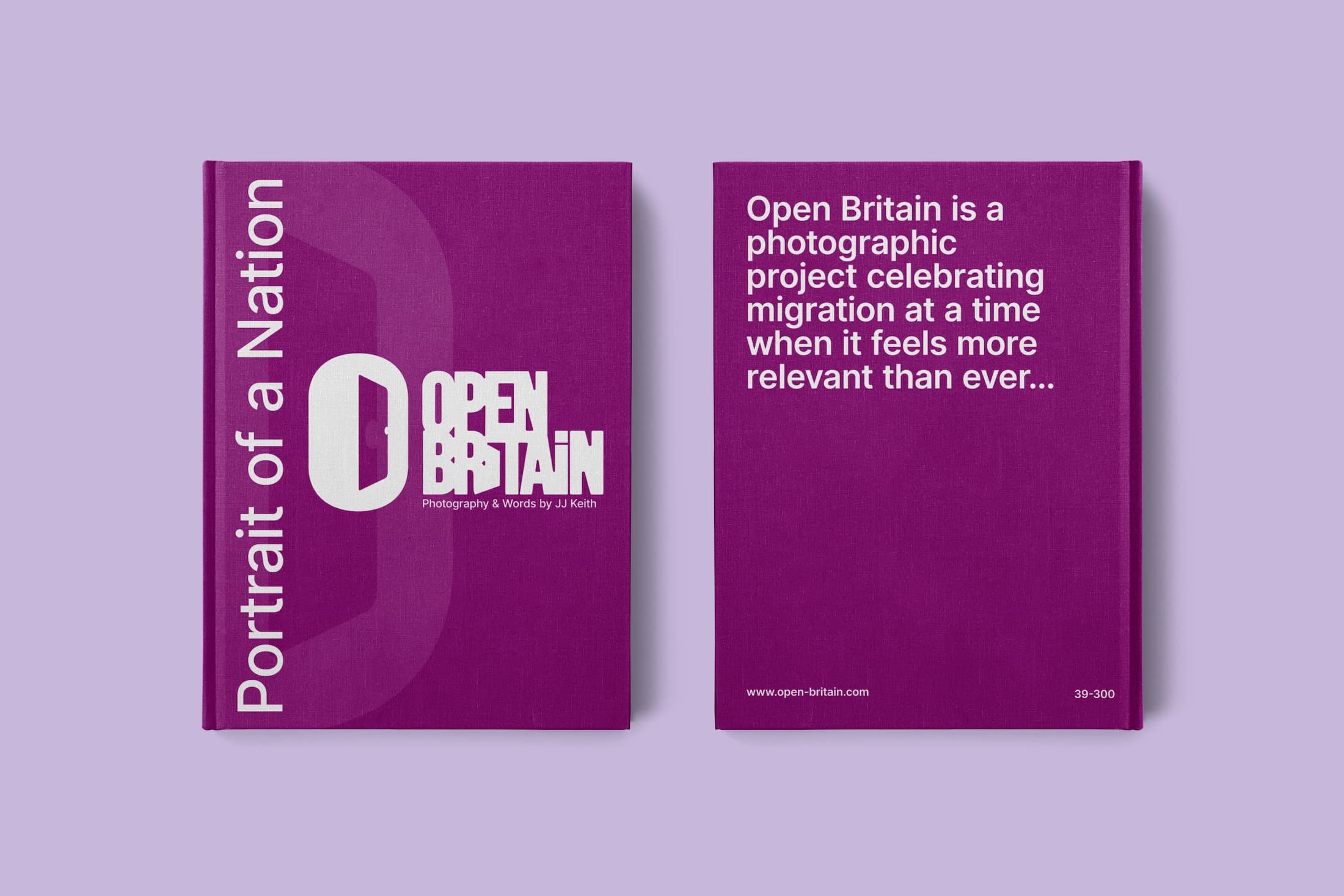
‘Open Britain’ is a photography project created to celebrate migration to Great Britain at a time when its relevance has never been more clear.
The creator wanted a logo to represent the project effectively and communicate the essence clearly.
Logo Design | Process
The client holds this project very close to their heart and being entrusted to create a logo to reflect the essence, values and energy of the project was a deep challenge.
It was important for the client that the project’s name/initials were incorporated in some way and that the logo brought to light the idea of doors being kept open to illustrate how migrants to the UK have kept the country running during some very difficult periods, especially in recent years.
I decided that the logomark and the wordmark should utilise the imagery of an open door and this image was to be integrated into the graphic design of each.
The logomark uses the letter ‘O’ and adds the letter ‘B’ in an internal doorway design.
The wordmark uses negative space to showcase a doorway in the first letter ‘I’ of the word ‘Britain’.
The colour palette brings energy to the design elements and also highlights diversity through contrast.
The designs work as a stand-alone logo mark, a stand-alone wordmark, or using them together, and both can scale from small to large formats ensuring the brands’ effectiveness across all touchpoints.