Kokoro was the evolution of solopreneur, Miranda Mason, offering specialist holistic health and well-being practices. Having developed a strong reputation and client list, it was time to take the business and build a brand,
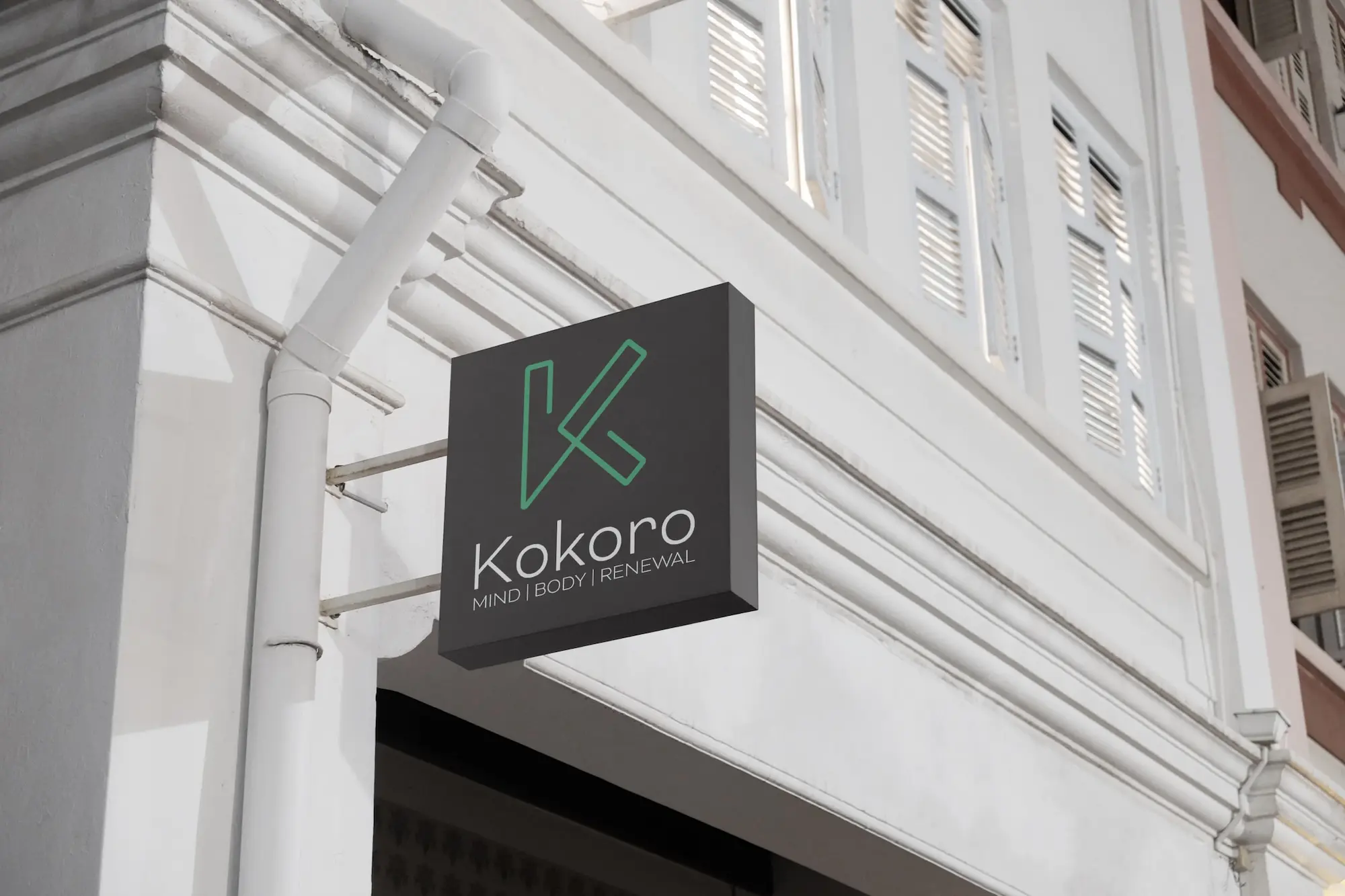
The name “Kokoro” is rooted in Japanese philosophy, symbolising the inseparable connection between heart, mind, and spirit. When someone is said to have a “good kokoro,” it speaks to the wholeness of their soul, mind, and heart working together.
This ethos of 'interconnectedness' was important to Miranda and she wanted this imbued into the design.
We worked closely with Miranda to help define the parameters of the project through an extensive set of questions we developed so that we could gain a full understanding of the brand, its values and the goals for the business.
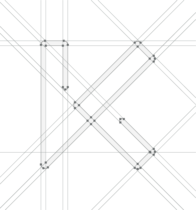
When exploring the ethos, we discovered the Japanese symbol for 'kokoro' and saw the beauty of the movement within the strokes. We agreed on the design direction with Miranda and initiated the design phase of the project, combining the movement of the symbol with contemporary adaptation to ensure that the final mark was both powerful, peaceful and modern.


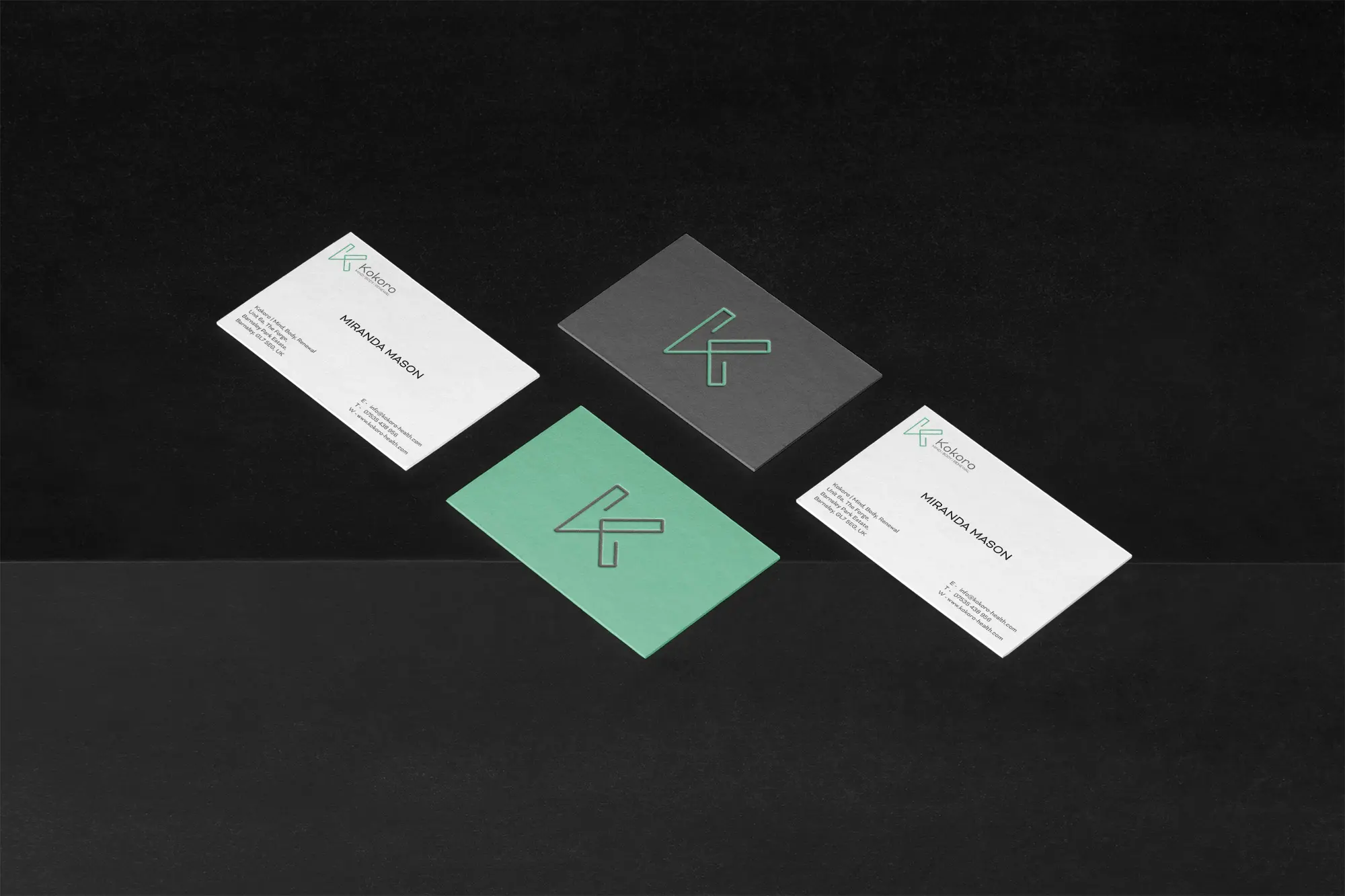
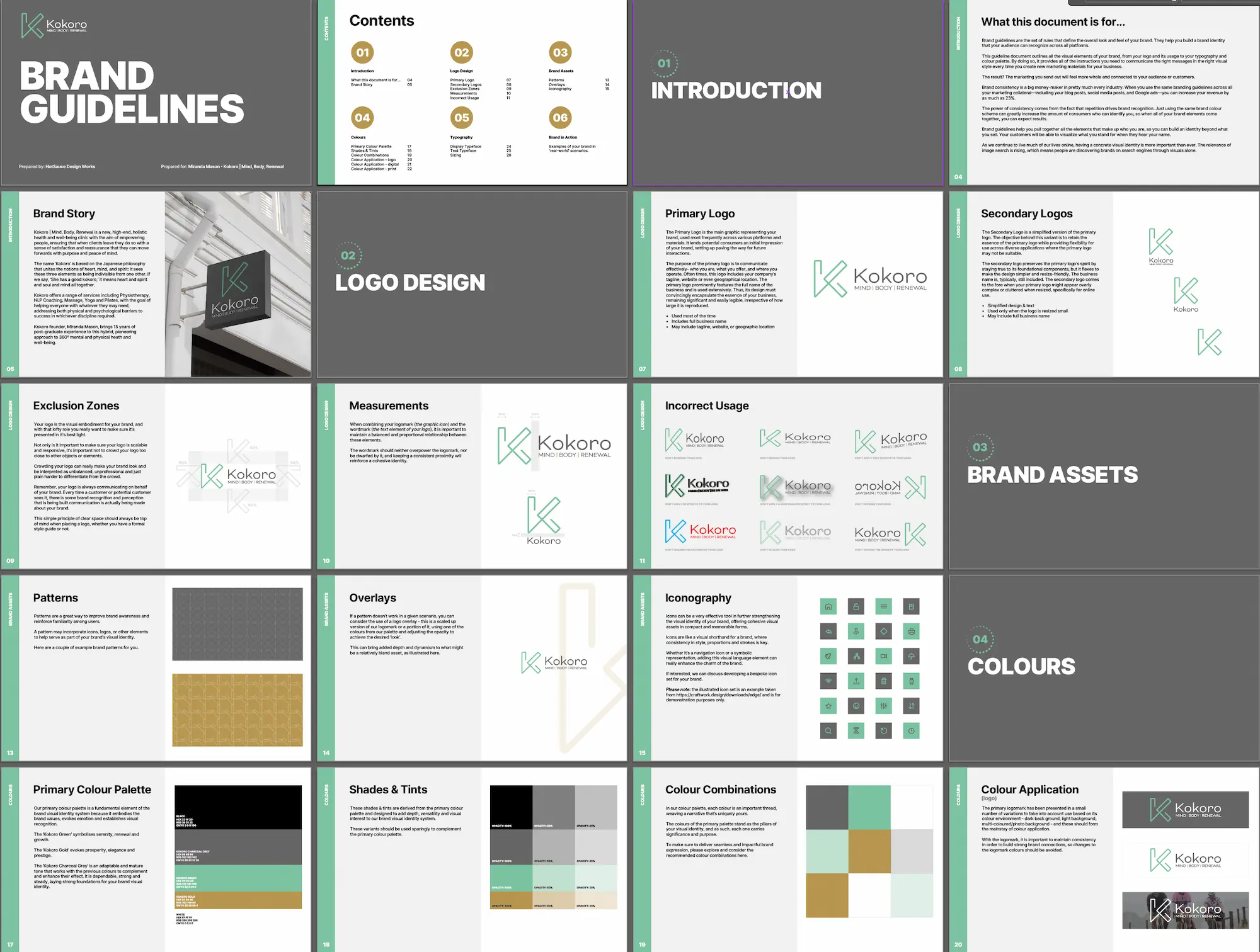
As with all client projects, we created a comprehensive Brand Guidelines document so that the client could use their branding without hesitation, and rely on this guide to ensure that anyone else (team member, supplier) woudl utilise their branding in the correct way.
It is crucial for the success of any branding to remain consistent and healthy in the use of any and all brand identity assets, and a Brand Guidelines document like this guides anhyone on the correct usage of the files and marks.
And breathe…
Brand design often reies on following a path, set by the clients' mission and vision, and enhanced by strategic thinking and intentional design that brings all these elements together effectively.
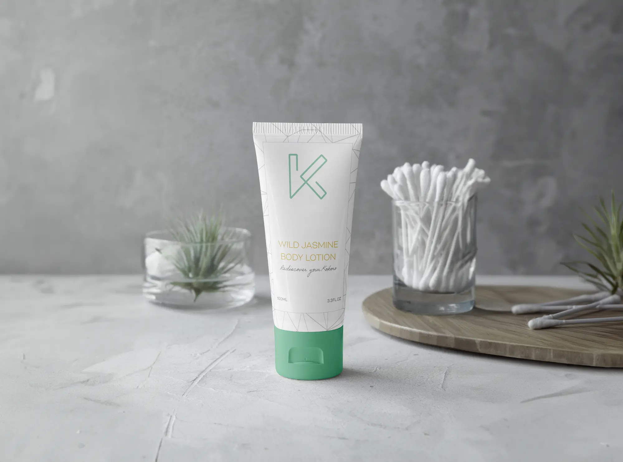
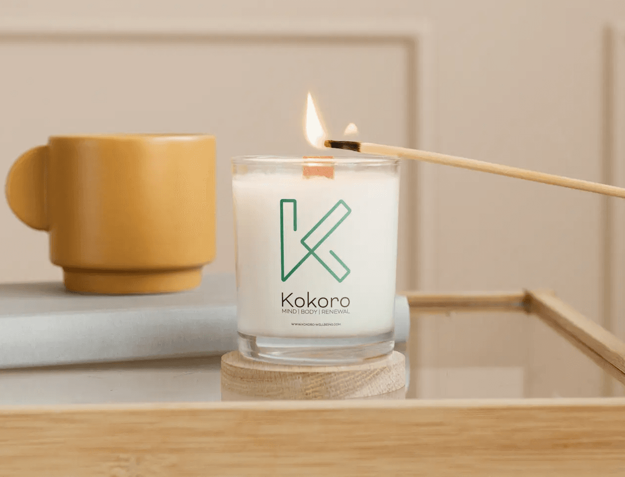
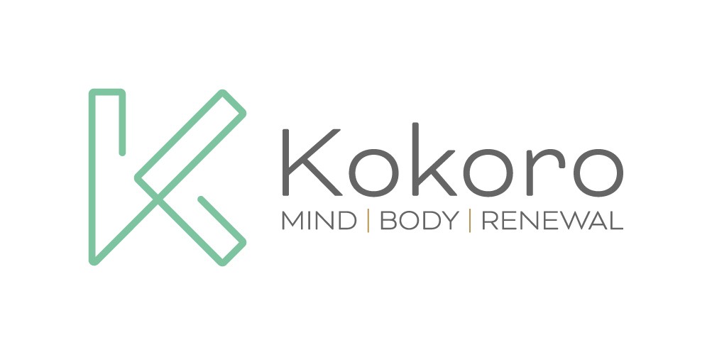
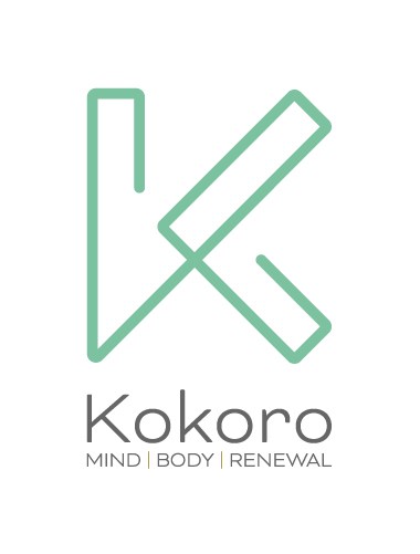
This project brought the simple mission and vision of its; founder into perspective by utilising the Japanese symbol for 'kokoro' as the foundation for a single line logo mark that showcased the simplicity of the business and its' goals.