
Albie & Walt is a lifestyle brand created for male teens and the founder wanted us to design a logo mark that would represent and resonate with their demographic.
We love a challenge and despite not being personally aligned with the teen market, we set out to dive into a little discovery phase. Through deep dives and thorough research, we locked onto a concept that we felt would meet the vision and mission of the founder - all borne from a simple concept.
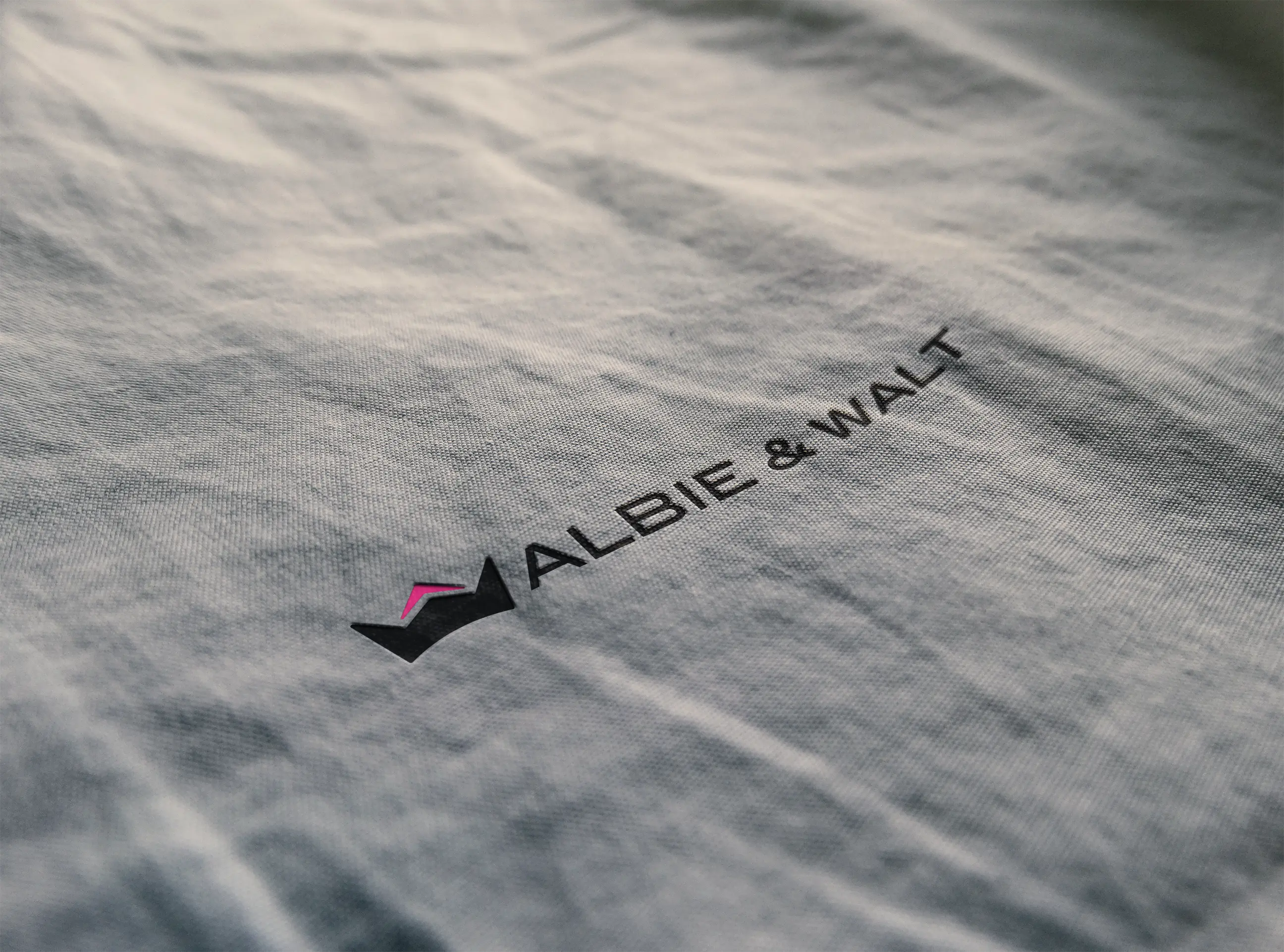


Our client approached us to design a logo mark that would represent this new and exciting brand, named after her two sons. The logo was to showcase the name/initials and convey a sense of leadership and growth.
We worked on numerous initial concepts but focussed on the letters, followed by defining leadership in a teenage sense. We developed the concept of 'Princes evolving into Kings and centred on a crown motif for the logo design.
We broke it down into two elements - for the two initials - and came up with a design that combined these with an arrow (for growth) all within a crown to convey leadership, and, let's be honest… crowns are cool!
The bold two colour palette using black and an electric pink again provided simplicity and conveyed a sense of energy, excitement and diversity.
The client was thrilled and the boys really liked it too!


This project highlighted the importance of simplicity and understanding that value doesn't always come from complicated design. Over-design can also be a brand killer, where this example showcases the strength of a simple concept executed through simple design to achieve simple success!