Cineverse Capital | Blockchain Investment for the Film & TV Industries
Cineverse Capital | Blockchain Investment for the Film & TV Industries
A brand identity built to foster recognition, trust and secure high-level investment.
A brand identity built to foster recognition, trust and secure high-level investment.
A brand identity built to foster recognition, trust and secure high-level investment.
Overview
Overview
A tech startup, aiming to tokenise film & television investment utilising blockchain technology
A tech startup, aiming to tokenise film & television investment utilising blockchain technology
A tech startup, aiming to tokenise film & television investment utilising blockchain technology
Cineverse Capital have a bold vision, aiming to democratise investment into the film and entertainment industries, making it accessible to anyone.
Historically, film investment relied on film studios, distributors and wealthy individuals, but now anyone will be able to invest even small amounts through a tokenised investment model.
After proving concept, developing their beta-platform, and before leaning into their funding rounds, Cineverse Capital wanted to develop their visual identity in order to present a cohesive, stand-out brand in which to invest.
Process
Process
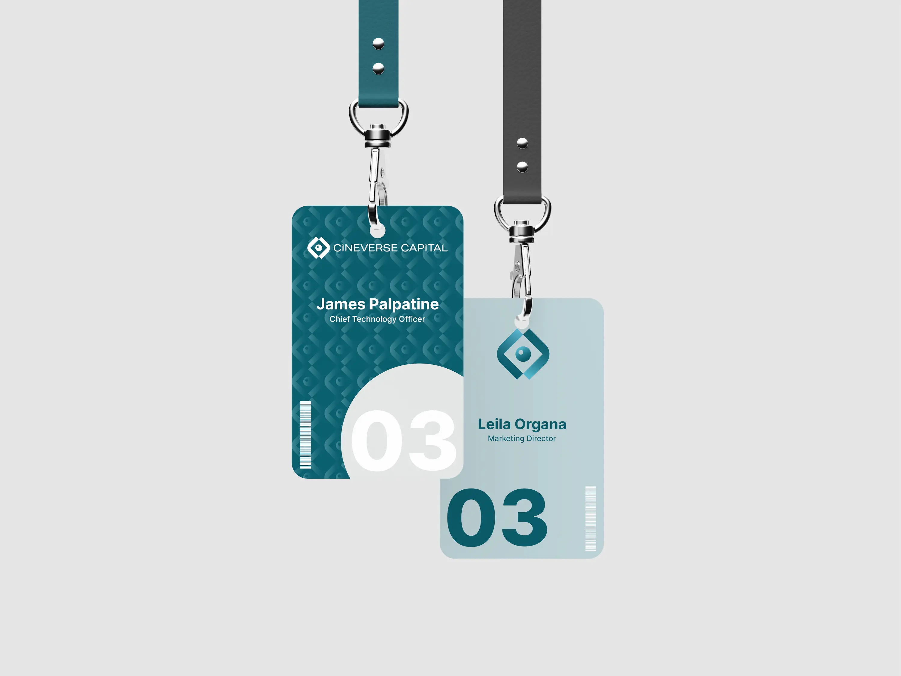
Blending Blockchain with Nostalgia
Blending Blockchain with Nostalgia
Blending Blockchain with Nostalgia
Our client wanted us to create a logo that would blend 'tech' with a little nostalgia, and bring in a cinematic marker.
We set out with word-mapping, creating styleboards and
Our client wanted us to create a logo that would blend 'tech' with a little nostalgia, and bring in a cinematic marker.
We set out with word-mapping, creating styleboards and


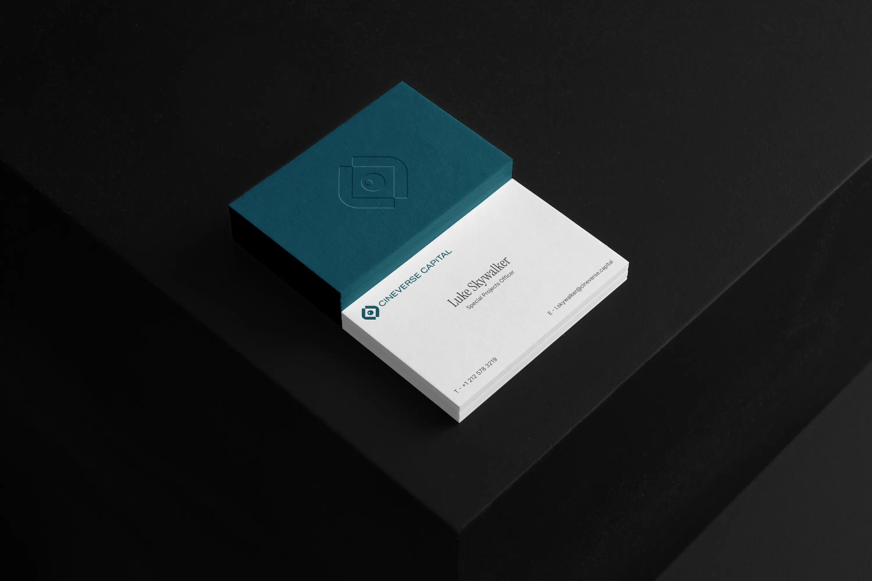
Complementary Word Mark
Complementary Word Mark
Complementary Word Mark
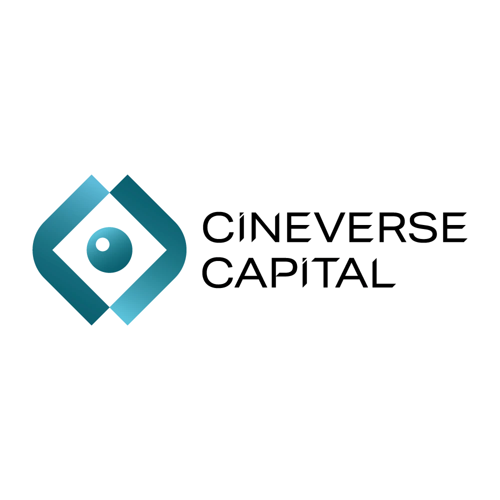
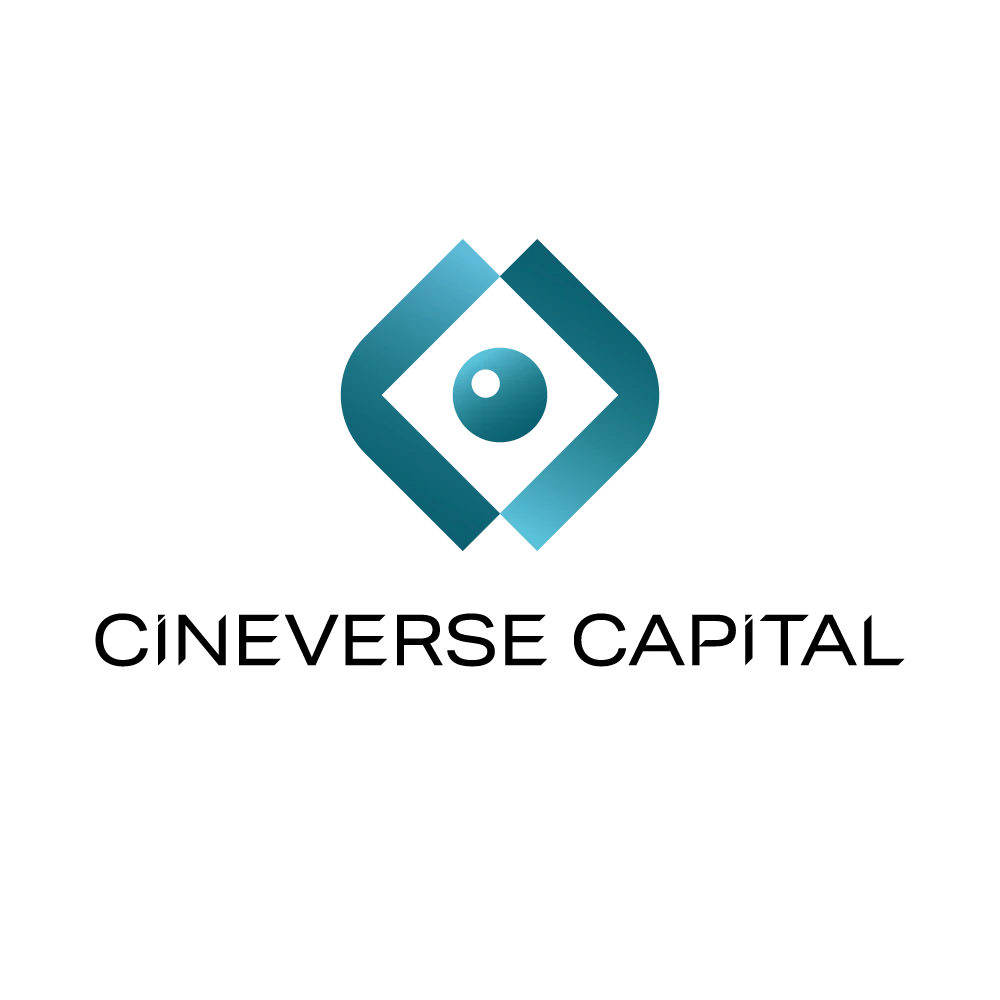
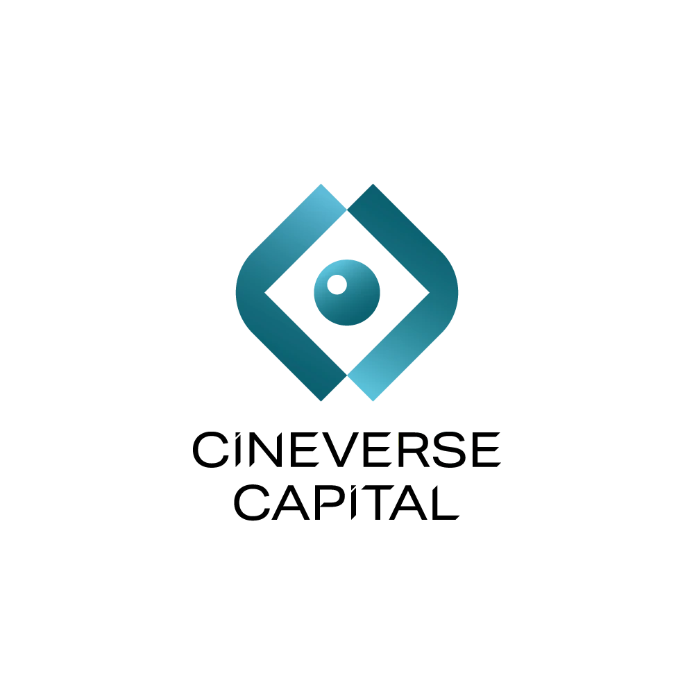
We also designed a bespoke word mark that would complement the logo and also stand alone for the brand.
We used sharp lines to evoke progress and technology, with angled 'cuts' as accents.
We also designed a bespoke word mark that would complement the logo and also stand alone for the brand.
We used sharp lines to evoke progress and technology, with angled 'cuts' as accents.
Summary
Summary
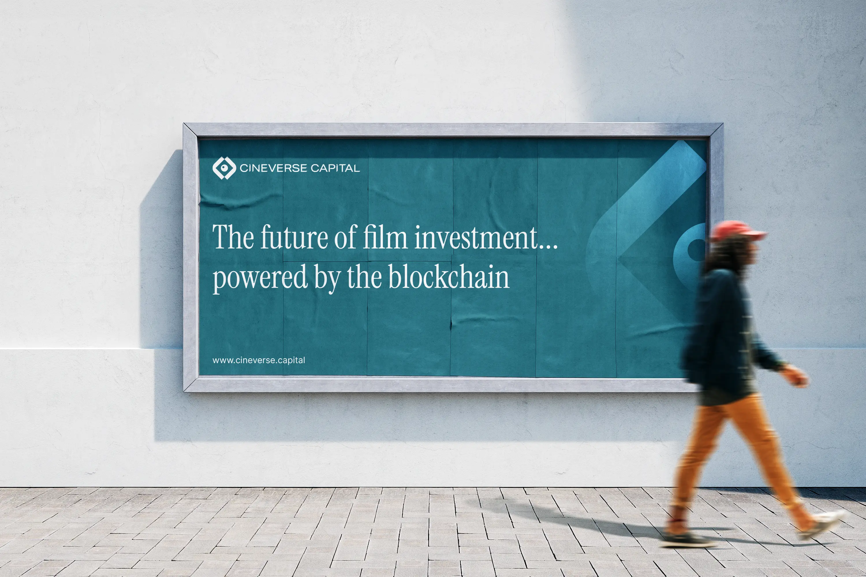
Nostalgia? Who doesn't love Star Wars?
Nostalgia? Who doesn't love Star Wars?
Nostalgia? Who doesn't love Star Wars?
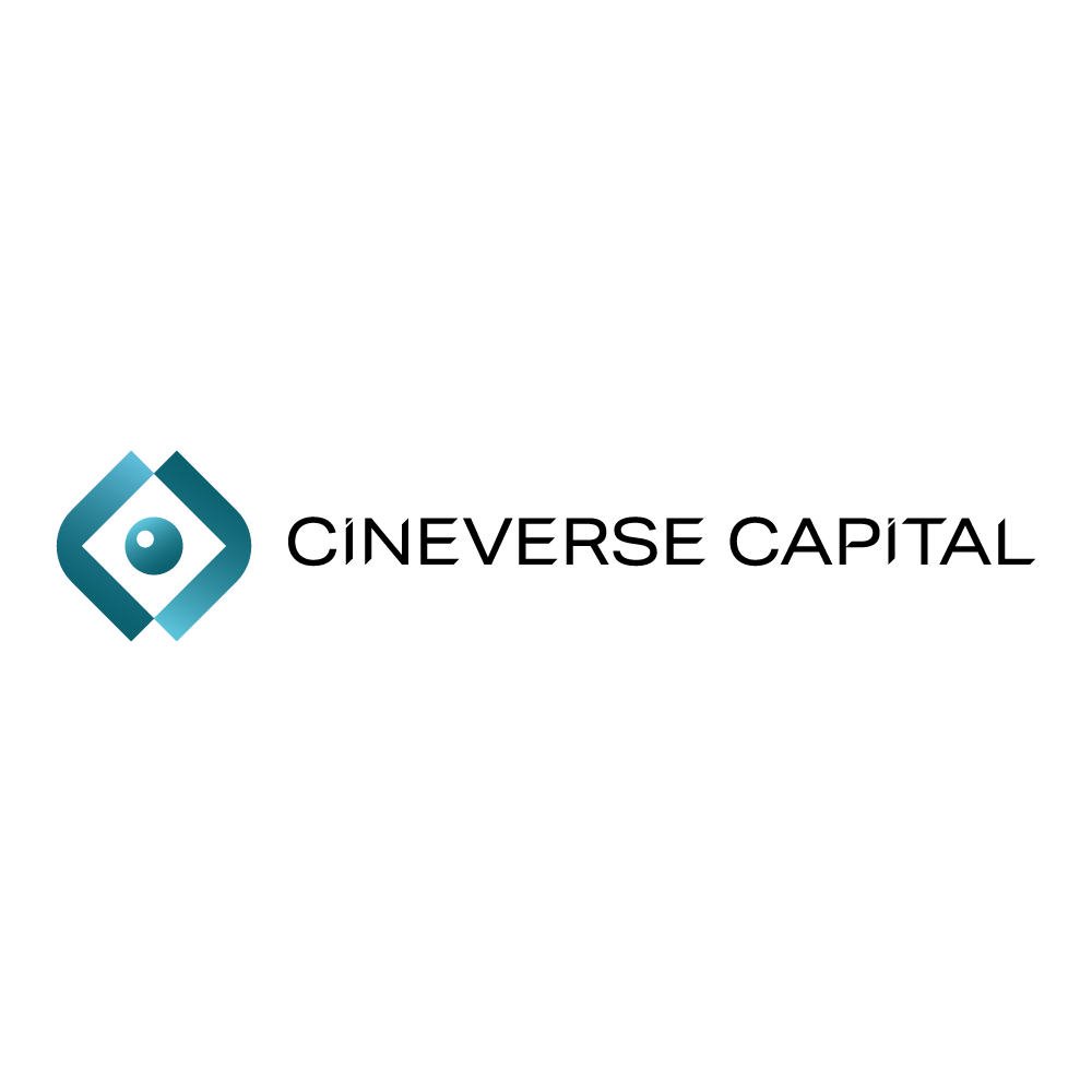
The design was influenced heavily through film, and a particular design element that the client loved was the small globe in the centre of the logo - the Death Star.
This addition really fed into the desire for a little nostalgia to be present within the design. Coupled with the mirrored 'Cs' inspired by directors framing shots with their fingers, the end result really hit the mark.